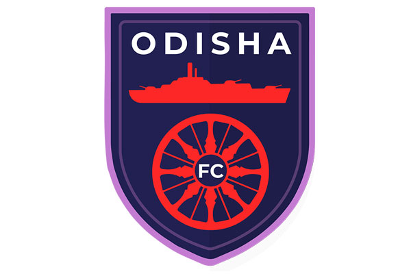
The latest addition to the Indian Super League, Odisha FC today unveiled its official logo. The club came into existence after an MoU was signed between Delhi Soccer Private Limited and the Government of Odisha, last month.
The logo of Odisha FC embodies the heritage and the culture of the state of Odisha and the vision and the ideology of the its parent company, GMS.
The chakra in the logo gets its origin from the famous Konark Temple in the state. The temple is designed in the form of a chariot and these 24 chakras are the wheels of it. Its position in the logo represents movement and development. The club always strives for excellence, and believes in youth power and thus the wheel of time sits at the crest of the logo.
The ship is a representation of GMS, the parent company of the club. GMSis world’s largest buyer of ships and offshore assets.
Speaking on the occasion, Club Director, Rohan Sharma said, “Our logo is the first step towards connecting with the people of Odisha. It’s a very vibrant and a colourful state and the logo represents it. The Chakra in the logo is again a reflection of the rich heritage and the culture of Odisha.”
Along with the logo, the club has adopted #AmaTeamAmaGame as its official tagline, which translates to Our Team, our game.
Disclaimer:
The information contained in this article is for educational and informational purposes only and is not intended as a health advice. We would ask you to consult a qualified professional or medical expert to gain additional knowledge before you choose to consume any product or perform any exercise.


